
Hot take: great summer design isn't about slapping a sun on it and calling it seasonal. It's about bold choices, unexpected textures, and visuals that make people feel something. We've rounded up five trends doing exactly that right now.
Summer is the loudest season. Every brand is fighting for attention, whether it's on a shelf, in feeds, on posters, or in inboxes. The good news? Most of them are playing it safe. Here's what's actually turning heads right now, and how to bring that energy to your own branding materials.
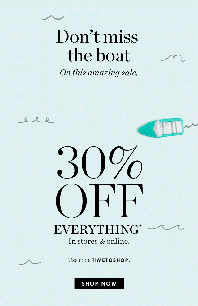
Big type that means business
If your summer campaign headline is sitting quietly at the top of the page, it's time to let it breathe, or rather, let it take over. Hyper-bold typography and high-contrast layouts are having a massive moment right now: think thick letters crashing into photography, running off edges, or stacked at a scale that commands the entire composition.
This works beautifully for posters, social ads, window graphics, and digital banners. Pick one punchy line and treat the typeface like the hero element, not a label on top of a design but the design itself.
Try it: Pair a heavy serif with a single saturated summer color, something like a deep coral, ripe mango, electric lime, or bright turquoise. Let the type fill at least 60% of the frame. One word with a big impact. Source
The beautifully imperfect finish
When the pixels are too a little too polished, it can start to feel uptight and uninteresting. Hand drawn illustration, slightly rough edges, and ink-bleed effects are showing up everywhere from packaging to event flyers, and they're landing brilliantly because they feel genuinely made rather than machine-generated.
For summer, this plays well with food, hospitality, markets, and festival brands. Earthy tones, craft-paper textures, and doodle-style details give designs a warmth that flat digital work often misses.
Try it: Swap a stock photo for a hand-drawn illustration of your hero product or venue. Even a simple line drawing with a grainy texture on top gives flyers and menus an instant personality boost..jpeg?width=500&height=663&name=_%20(3).jpeg) Source
Source
Nostalgia with a twist
Retro never really left, but right now it's getting a very specific upgrade: vintage visual cues (classic poster composition, faded colour palettes, old-school logo styles) are being mixed with crisp modern execution. The result feels familiar and comforting yet exciting at the same time.
Think sunny 70s beach imagery remixed with bold 2026 typography. Or a summer sale campaign that looks like it was pulled from a coastal general store, but works flawlessly as a Reel or Story. That tension between old and new is what makes people look twice.
Try it: Pull a vintage color palette like dusty terracotta, faded denim, or warm off white, and pair it with a contemporary typeface. The past never looked so current.
%20%E2%80%A2%20Instagram%20photos%20and%20videos.jpeg?width=500&height=626&name=Vacation%C2%AE%20(@vacationinc)%20%E2%80%A2%20Instagram%20photos%20and%20videos.jpeg)
Tactile & sensory digital
We spend so much time on flat, glowing screens that design which convincingly looks like physical texture stops us cold. 3D objects, sculptural shapes, embossed-looking typography, and materials that feel like you could reach out and touch them is the direction premium digital marketing is heading in 2026.
For social content and digital ads, this is a genuine differentiator. A product shot with soft dimensional shadows or a sale banner built around a beautiful 3D element immediately reads as more premium, more considered, more worth clicking.
Try it: Even simple techniques help, like a subtle emboss on your logo, soft long shadows on a headline, or a product mockup with realistic lighting. You don't need a 3D studio; you need an eye for depth.

Motion-first, always
Here's the truth: if your campaign doesn't move, it's at a disadvantage. Motion-first design means thinking about animation from the very start, not adding a quick fade at the end, but designing assets where the movement is part of the idea. Animated word reveals, stickers with a wiggle, or elements that drift in like heat haze.
This doesn't have to be complex. A single, well-timed element moving on an otherwise static card can be more effective than an overproduced video. The key is intention: movement that adds meaning rather than just noise.
Try it: Take your best static social post and add one animated element: a rotating badge, a headline that types on, a price tag that swings in. Export as an MP4 or GIF and compare the engagement. You'll convert.
Ready to make something unforgettable?
Summer moves fast. Whether you need a full campaign or a quick refresh, MADE is here to make your season look exceptional.