
PMS colors. You’ve heard of them. You interact with them every day and you may not know it, but your favorite color has a number all its own. From “Orange (PMS 172) and Blue (PMS 287)” to “Garnet (PMS 195) and Gold (PMS 7502)” (and every color in between), our world of colors has a number classification, and it's one of the most important tools of our creative trade—the Pantone Color Matching System.
In 1963 the Pantone Color System was launched. The purpose of this color system was to help simplify complex color matching problems in the printing industry by giving a number to every color and every variation, tone and tint of that color. This universal matching system has been the go-to matching system, globally, for paint, textile and plastic manufacturers, designers and printers.
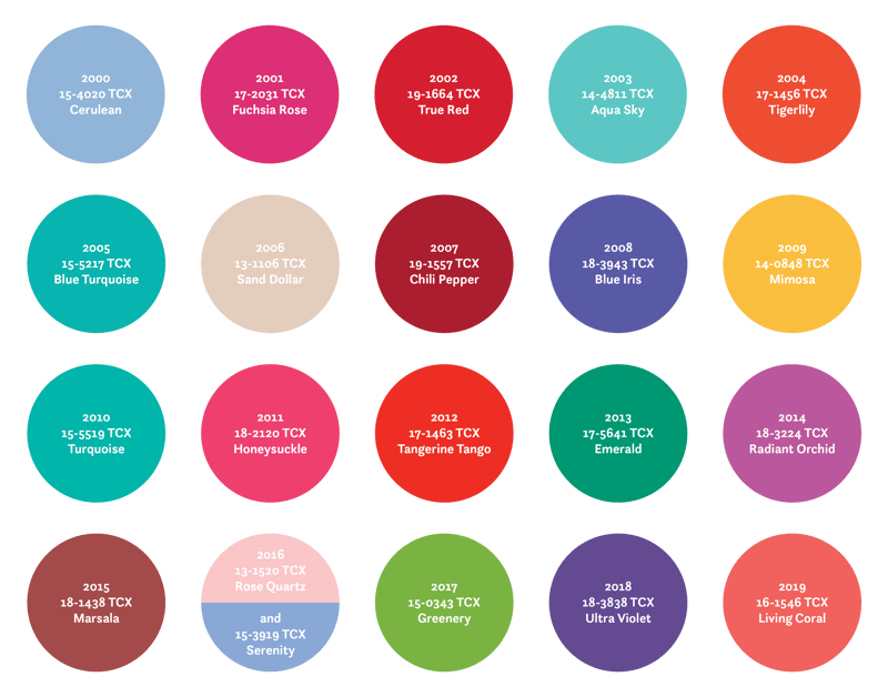
Every year since 2000, the Pantone Color Institute has put out a Color of the Year. Released every December, this color sets the pace for the marketing, branding and creative industry for the upcoming year, and has expanded to home interiors and cosmetics. The Pantone Color Institute takes many aspects into consideration like fashion, politics, marketing trends, etc. in order to determine this much-anticipated color. This color is so influential, that it has taken on a life of its own and hundreds of brands design products around the color.
With the announcement of the 2020 color of the year just around the corner, we wanted to take a look back at the past decade of color in anticipation of the 20th anniversary of the Color of the Year.
Until we meet again, when the next Color of the Year is announced, I'll leave you with this this...
“Color is a power which directly influences the soul.”
Wassily Kandinsky
As we reflect on two decades of vibrant creativity and innovation, we would love to be part of your journey. Whether you're looking to elevate your brand, explore new design possibilities, or collaborate on an exciting project. Contact us today, and let us help bring your vision to life.