
Hi, kids! Today we’re going talk technical terms about type. Let’s get nerdy…
People hear that you’re a designer and think, “Oh fun! You get to draw pictures all day!” True—it is fun! And it’s got bonuses, like in my case, where I get to work with fun people and I can wear jeans every day. There are definitely perks. But it's not ALL fun and games. Designers also have to know things—technical things—and occasionally do math, but I don’t want to scare you, so I’ll stop there.
Want to hear something ironic? I can’t spell. Like, at all. Nor can I type in a legible fashion. Spell check basically wrote this blog. I’m dead serious! My friends joke that I have my own text language, but I can point out a typo on someone else's work in no time. I promise I’m not a bad person! #irony
All kidding aside – the purpose of this blog series is to shed some light on terminology that you may hear when working with a graphic designer on a project, or even starting out as a designer (student, freelance, etc.). I’m going to break it down into a few separate blogs so that the info is a little more digestible. For now, we’re going to stick with some technical terms regarding type. Yes, there will be pictures. You’re welcome.
Be warned: What I’m about to show you can’t be unseen. There are details that, once you know them, you’ll never be able to see things the same way again. The most common place to see these mishaps and broken rules is on the various memes that flood your Facebook and Instagram feeds. You’ll see what I mean.
When we’re working on projects, no matter how simple or complex, there are a few rules that are in play at all times. Small details make a big difference. Details that can stand out like a sore thumb when ignored. Let’s dive into a few things about type and how to keep it look nice and professional.
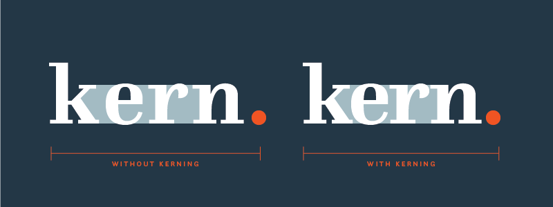
KERNING
Kerning is the adjustment of space between two letters, numbers or characters. It’s all about finding a pleasing proportion and balance of letters that make your eyeballs feel good. You’ll know it when you see it. Here’s an example:
TRACKING
Tracking is similar to kerning, but rather than it creating a pleasing space between individual letters in a way it looks nice next to its friends, this is about how much space is between all the letters—how spread out they are. You can have loose or tight tracking. Adjusting tracking can change the appearance of the density of letters when there is a lot of body copy. Adjust to a nice middle ground that works with your layout and promotes legibility. Some fonts shouldn’t be used with loose tracking, like script fonts. (My skin just crawled a little.) Here’s an example of loose vs tight tracking.
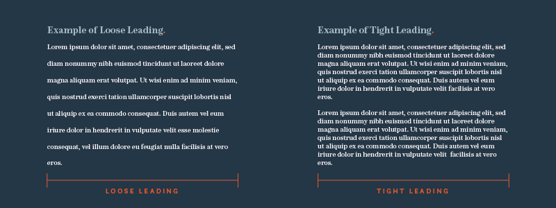
LEADING
(pronounced like “ledding” – like “sledding” without the “s”, like “bedding” without the “b” – you get it.)
Leading is the space between lines of text. Much like tracking, which is between letters, leading is its vertical counterpart. Leading that’s too close and make things hard to read and letters can overlap making your text illegible. You want to use a nice balance of leading and tracking. Here’s what this looks like:
And there it is, a super basic look at just a few of the common terms in the graphic design world. If you’re a beginning designer or simply trying to figure out what the heck your designer is talking about, I hope you find this series useful. And remember, while these are "rules", sometimes rules can be broken if the shoe fits—just break them wisely.
Ready to bring your next project to life with clarity and creativity? We’d love to hear from you! Contact us today!